Creating a luxury and minimalist sushi delivery experience.
User research • Information architecture • Wireframing • UX Writing • Art Direction
Designing a distinct delivery app for the Parisian sushi lover was a very fun challenge. It had to fit the luxury sector, portray pure minimalism and be an intuitive experience.
From the first tap to the doorstep Orient’s delivery platform had to provide a seamless and easily customisable order flow.
— This was the perfect opportunity to put my packaging design and retail background to test and create a clean and enjoyable online ordering experience.
Discovering the ideal interaction
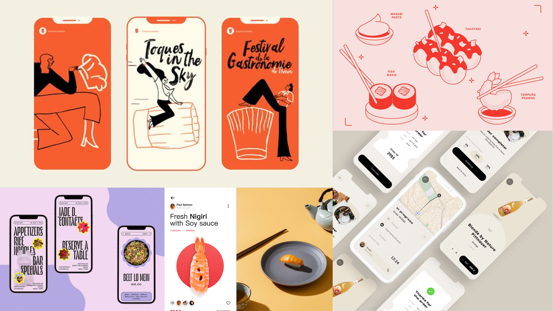
After benchmarking and brainstorming, a quick moodboard was born. The clean and elegant yet groovy aesthetic was there but it was known that with the use of product photography things could either have a cheap or high-end look and feel. With the resources given and after a round of lo-fi wireframes it was clear that no pictures would be used.
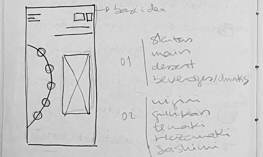
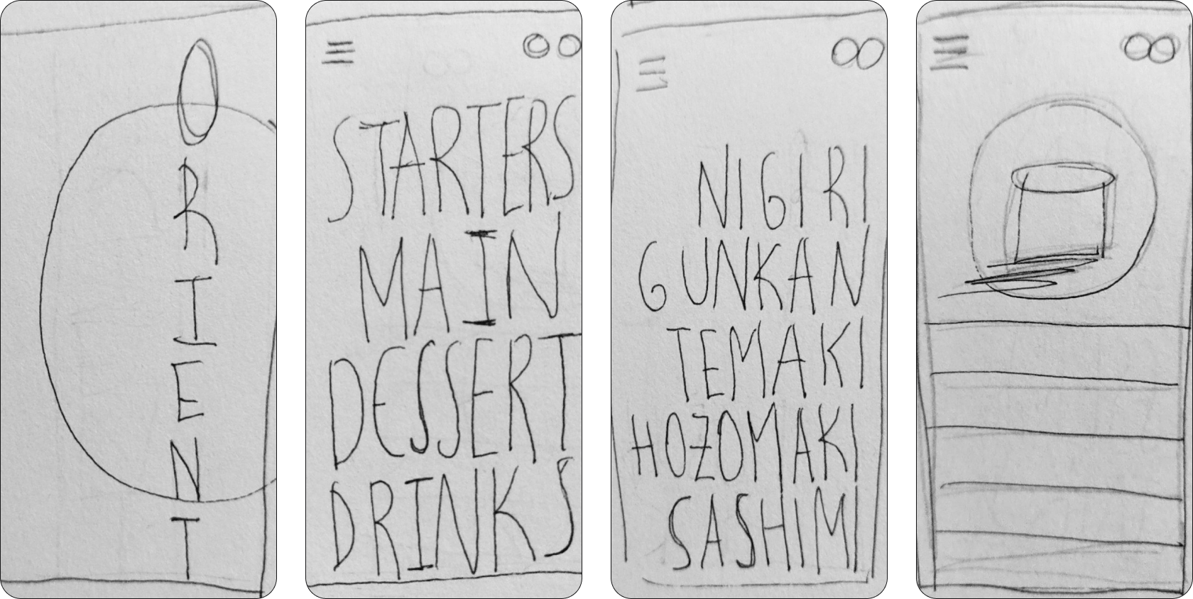
The first idea looked fun and, in its own way, worked around the “O” of the restaurant’s name but the way the menu was supposed to work, in a circular motion, wasn’t given enough space to showcase more information with each item.
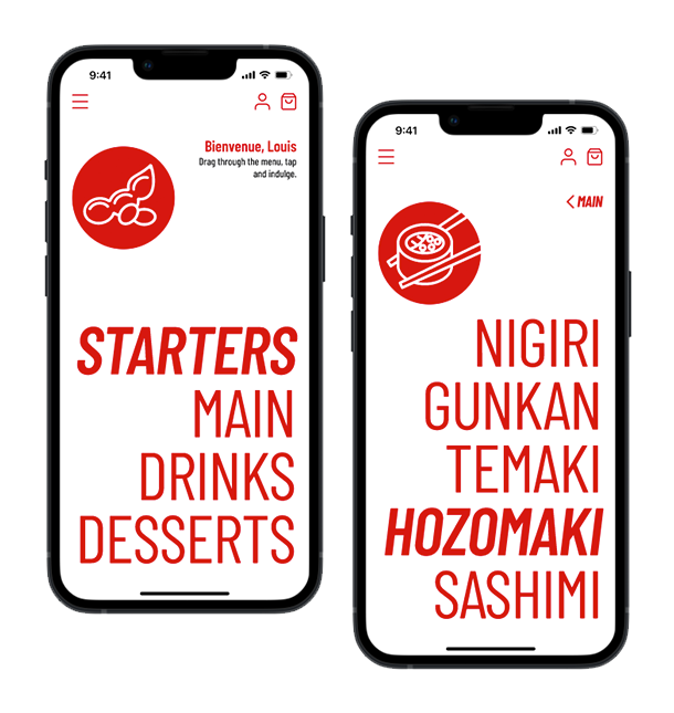
In order to keep things simple and, being an app for sushi lovers, we closed the menu to the most popular sushi pieces and were able to simplify things with a selected offer.
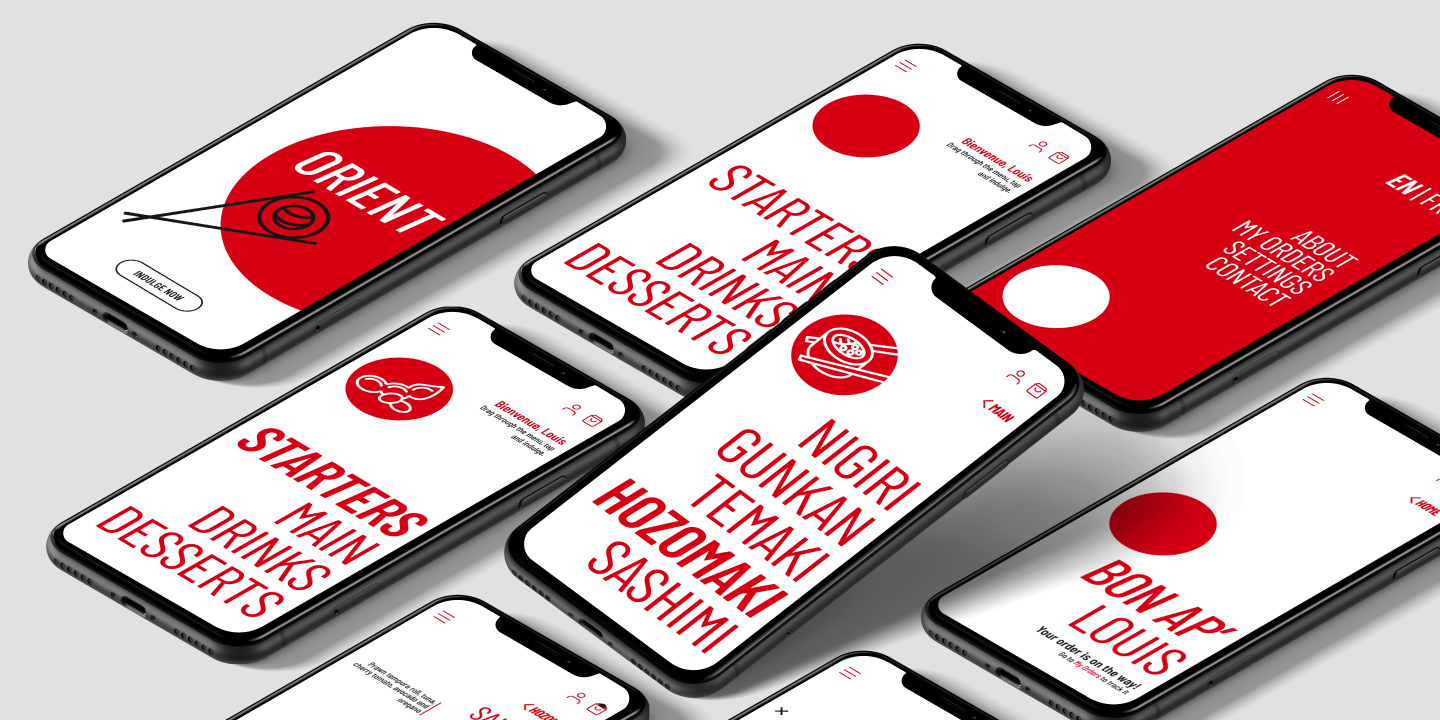
As the first sketches lead to nowhere, a second round came with a very editorial and sleek perspective. What if we focused on typography? If the restaurant has a top quality perception and the users will already be connoisseurs of its fine menu, why not simplifying things to the max?

Red, white and black. For a minimalistic aesthetic, centered on type, an straightforward colour palette was selected, and simple icons were created.
Although the Japanese heritage was evident colour wise, we wanted to take the homage to another level. Firstly, with the noticeable presence of the circle across most screens. From the flag to Orient’s “O”, it was crucial to reference it. Secondly, by using the reversed Z shape positioning of UI elements, giving a nod to the Japanese written format, tategaki, where characters are written in columns from top to bottom, right to left.
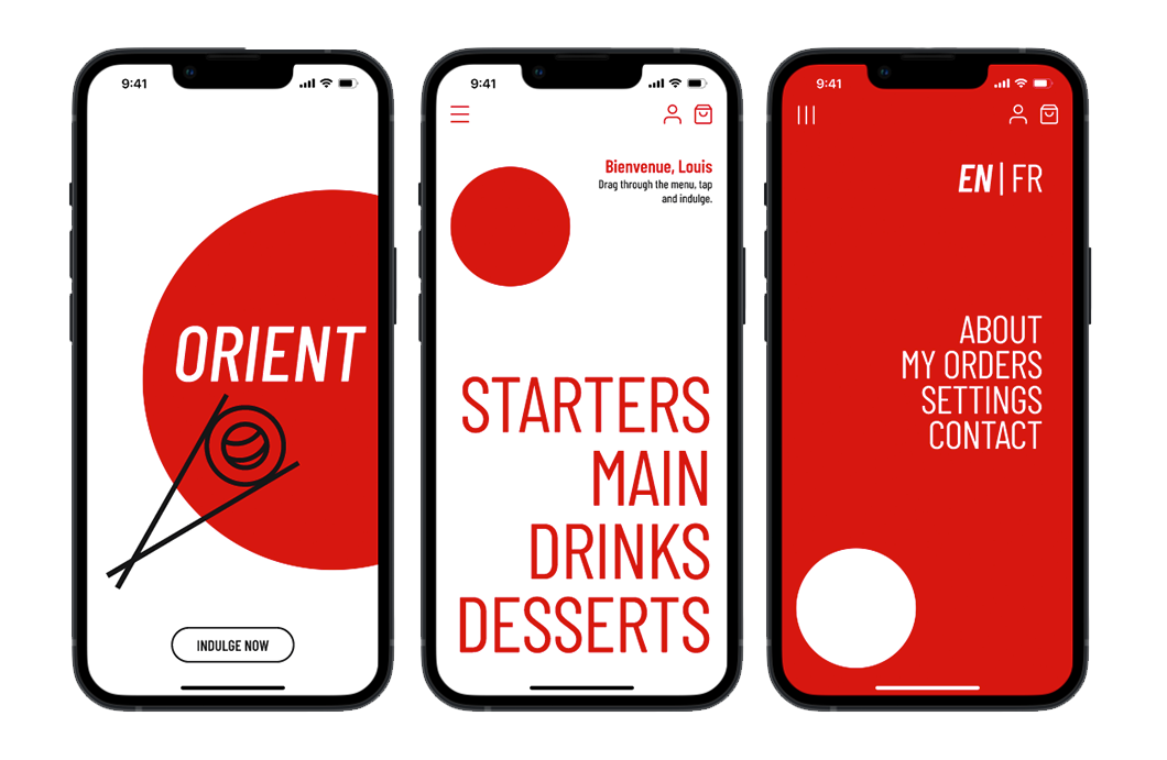
Bienvenue !
“Drag through the menu, tap and indulge.”
With a curated menu, from starters to desserts, the user can make a selection of their favourite pieces and customize them with the fish of their choice, tailoring the ideal sushi combo.
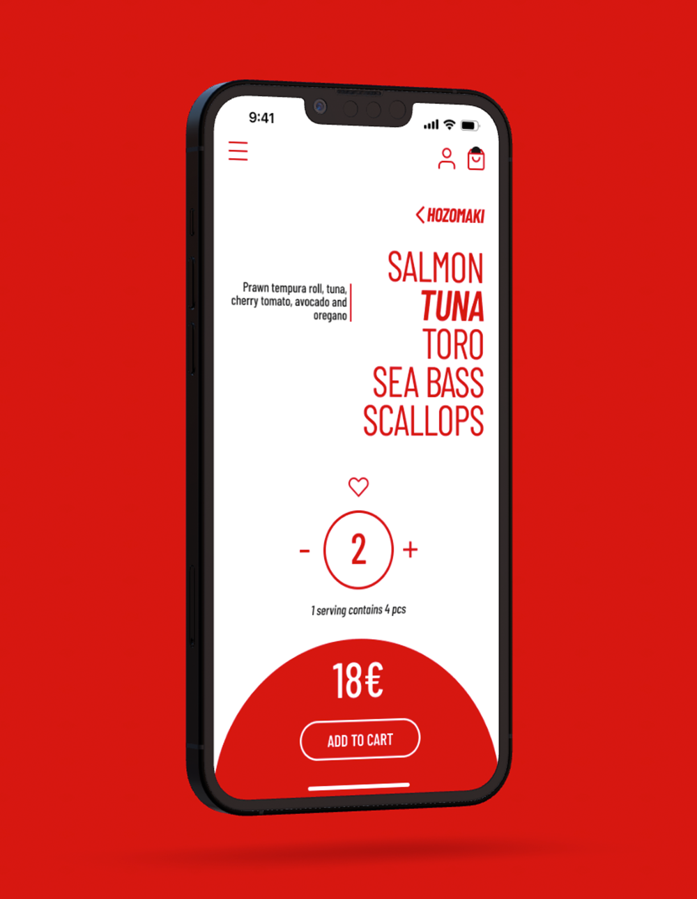
When choosing the piece type, a selection of fish and the corresponding ensemble is presented. Here the user can choose the amount of pieces of their liking, add them to a favourites list and keep track of the cost.
Creating an account enables users to track their progress and unlock the full experience of this practice: gain valuable insights, accumulate experience, monitor growth and deepen their mindfulness journey.
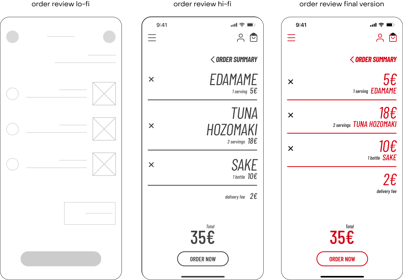
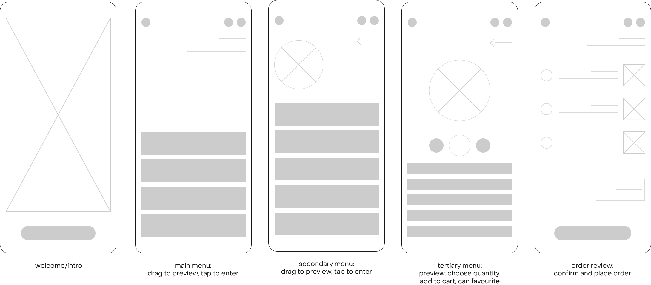
This meant highlighting the most important piece of information within each step. A/B testing lead us to pursue an “order review” where the price was the focal point.
Another important factor was to be able to speak directly to this market niche: Parisians with a love of sushi.
Having this in mind, the app had to be bilingual (English and French) with the added appeal of having small details in French, being this the case of a sushi restaurant located in the heart of Paris.
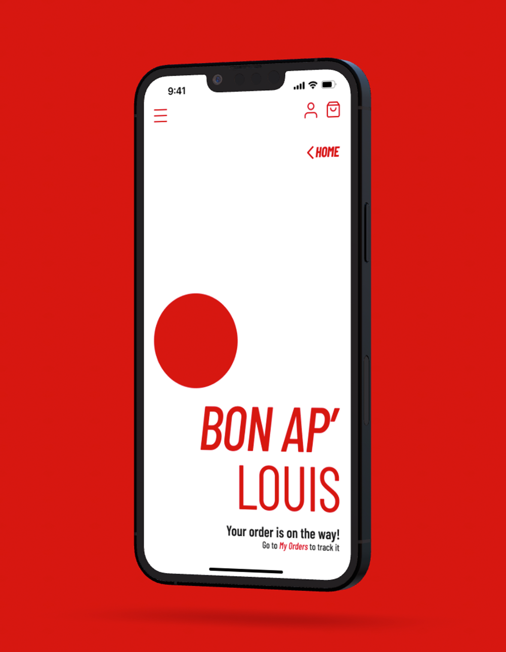
Chic, clean and seamless.
A customisable sushi experience where the user can easily craft, order and savour their creation. Plus, a faster service on the following order, made possible by logging in and keeping track of favourites and combos.
