What connects the online and on-site experience of a museum?
Heuristic evaluation • UX Writing • Wireframing • Prototying • UI design • Rebuild and enhance the user flow
— The journey and what you can discover from it.
Both experiences should be an extension of the museum’s values and motivate the user/visitor to explore and learn what it has to offer.
The site had problems on its navigation flow and the way it presented information: with no guiding path, an overload of pages and a sterile design, it lacked accessibility and intuitiveness.
On this project, the duo was challenged to redesign two pages of the Berardo’s Collection website and enhance the overall experience.
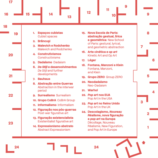
FIG.02 The existing floor map leads the visitor through several modern art movements.
As the museum invites visitors to freely roam through its collection, with a section for each art movement, the user’s experience should evoke the same idea through the navigation flow.
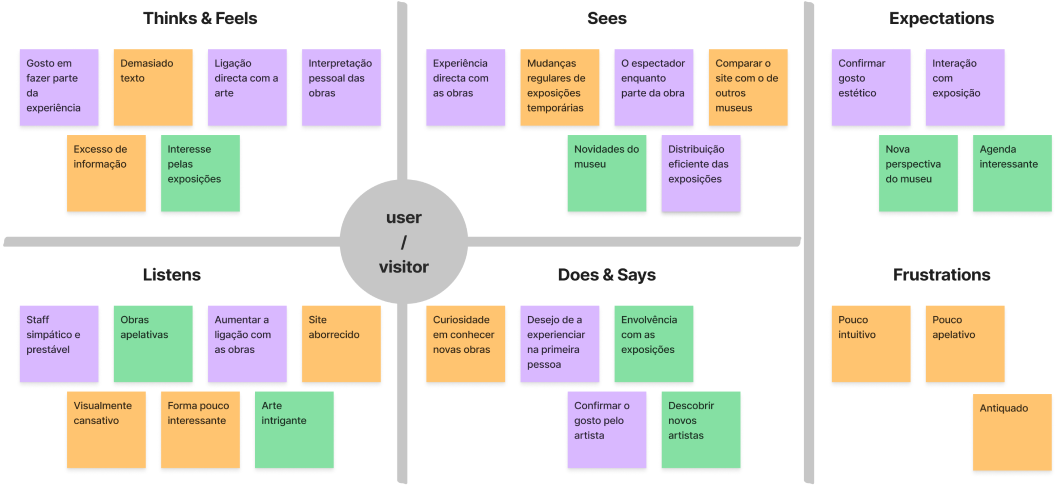
FIG.03 Through the lens of an user/visitor persona, the empathy map gave us insights on what was expected of both online and on-site.
By connecting both visits through the same principle, the main goal was to drive users to become visitors, making their journey online to the museum.
It was imperative to restructure the sitemap, reorganize its content and renew the tone.
Unveiling new pathways
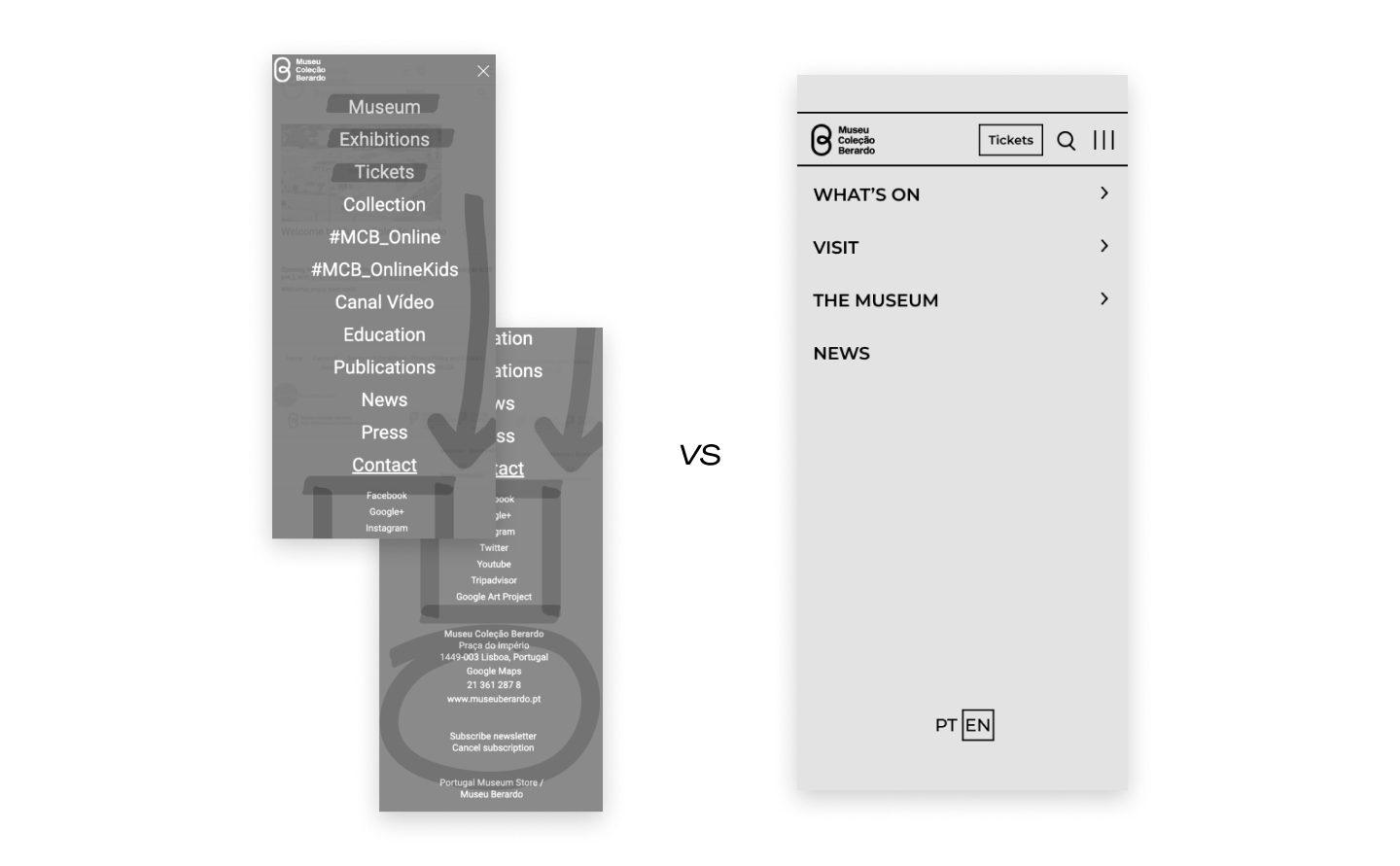
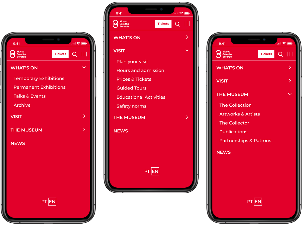
A card sorting test helped improve the information architecture, leading to parallel flows on both Portuguese and English versions. Given the initial misguided paths and large amount of pages, a tree testing was conducted to validate a new structure, as seen below.
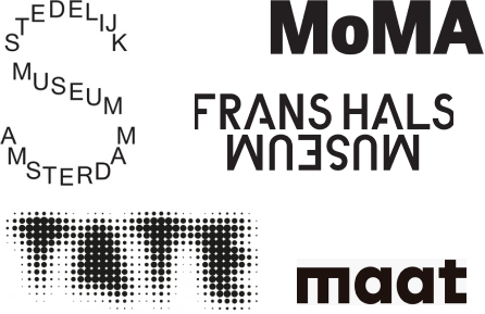
It was crucial to see how other museums laid their user flow and connected it to their image & ethos.
With clear information and clever highlights, always on display ticket button, and a well established design system, most museums’ websites offer a seamless experience.
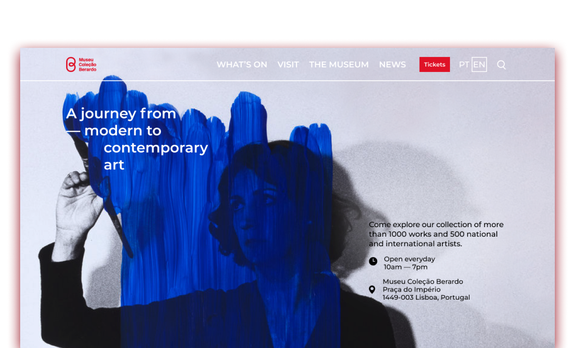
What was missing from the MCB’s website was an appealing and focused landing page, where the user could easily search for content, get to know the museum and plan a visit.
The homepage flow and layout were key to convey the idea of a journey of exploration.
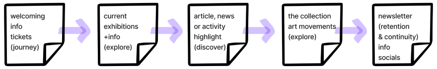
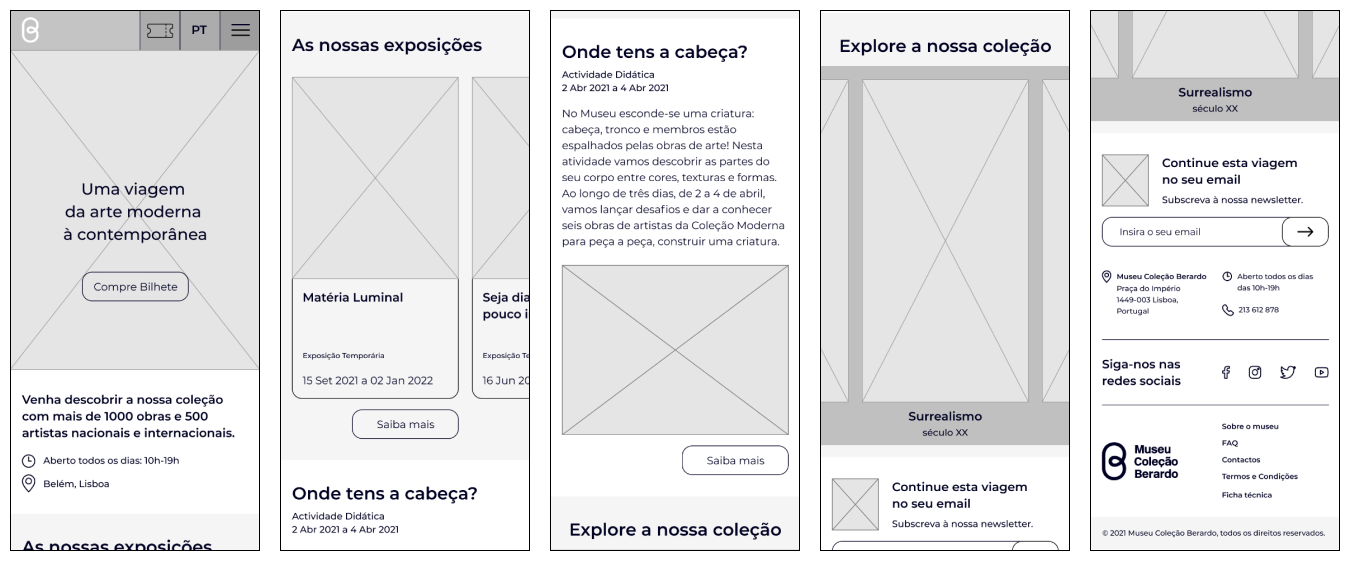
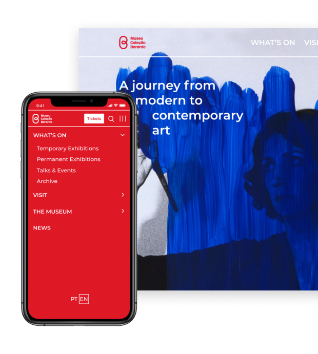
FIG08: Early wireframes of the mobile homepage.
Through ideation, moodboarding and iteration, a few solutions were explored to achieve a simple and more direct layout.
With the new proposal, the user could quickly look and search for what the museum has to offer as well as get a sneak peek of the exhibitions, buy tickets, plan a visit, read publications or sign up to the newsletter.
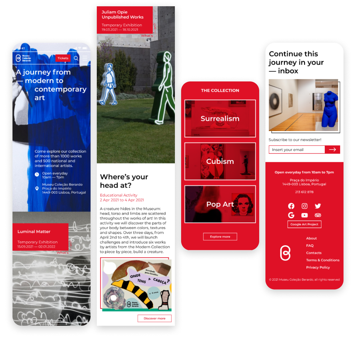
FIG09: Final mobile homepage.
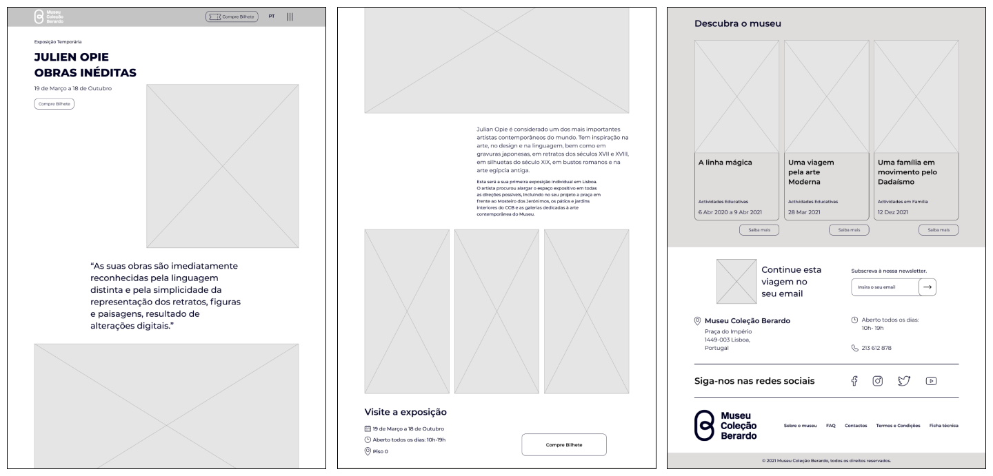
FIG10: Early wireframes of an exhibition's page.
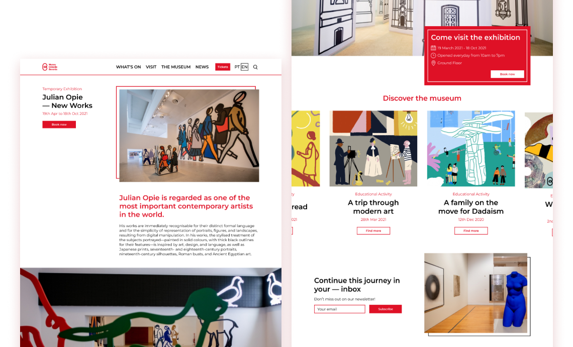
FIG11: Final design of an exhibition's page.
Connecting the dots
At the discovery stage, the users’ pain points and main insights translated into the site’s problem of navigation. When defining the strategy, the leading concern was to rethink how the content was shown and how it could guide the user and facilitate their searches.
Closing the framework on the design phase, the main goal was not forgotten: turn users into visitors. With a simple and clean interface, a more dynamic flow was created to catch the eye of the user and keep engagement.
As this was a personal project, we didn’t gather any real data on our proposed new flow and design, but given the opportunity, we hoped to help improve the retention rate and create new visits to the site which potentially lead to a booking.