How can we simplify the management of get-togethers?
User research • Information Architecture • Wireframing • UX Writing • Prototyping • Build a consistent design system
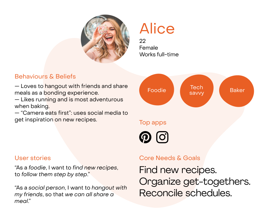
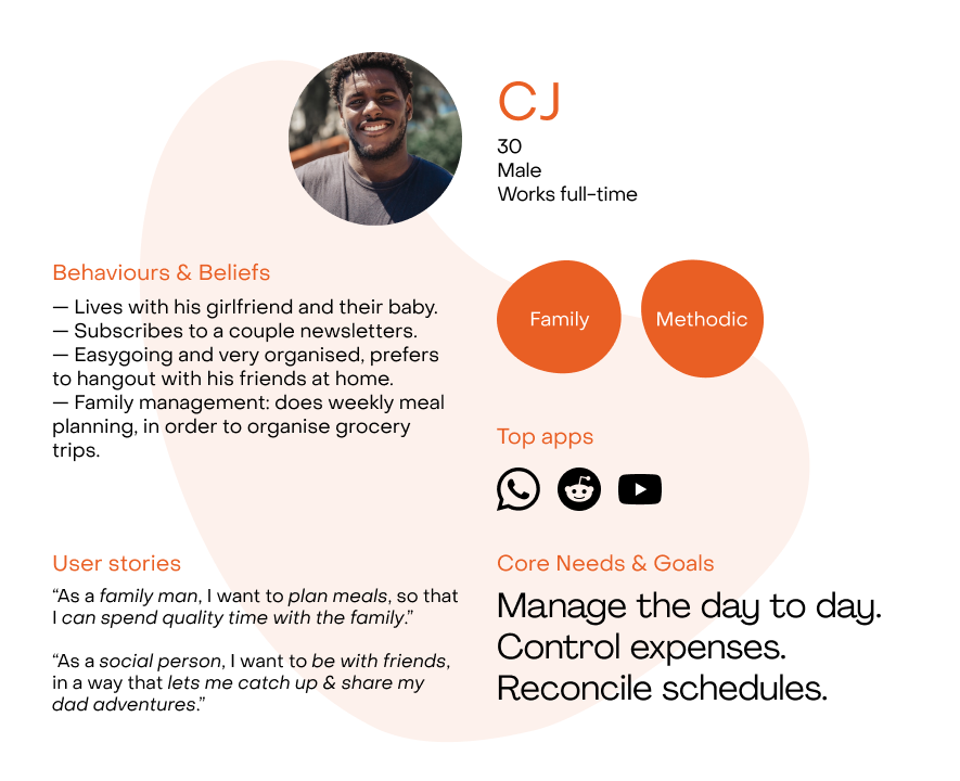
When organising a social gathering we need to consider scheduling, meal types and bill splitting. The complexity of these steps helped us define our user's main pain points and create two personas on the discovery stage.
Personas
After collecting a pool of hypothetical user needs, a ten question survey was developed to validate them, get insights and define the problem statement.
With about 116 participants, we managed to reach a substantial target regarding age group and work situation.
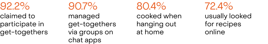
A problem of management: these four insights led us to the strategic starting point, where the problem had two types of steps to consider.
1. A get-together usually involves: settling a date, communicating availability and confirming attendance.
2. When taking place at someone’s home, it needs to also consider: choice of recipe, grocery list and bill splitting.
These findings helped us define the main features of the app and build the information architecture with two main areas:
1. Event manager tool
2. Recipe database
Through card sorting, we validated how each area would fit across the core ones, so the user could easily navigate the app and know where to go.
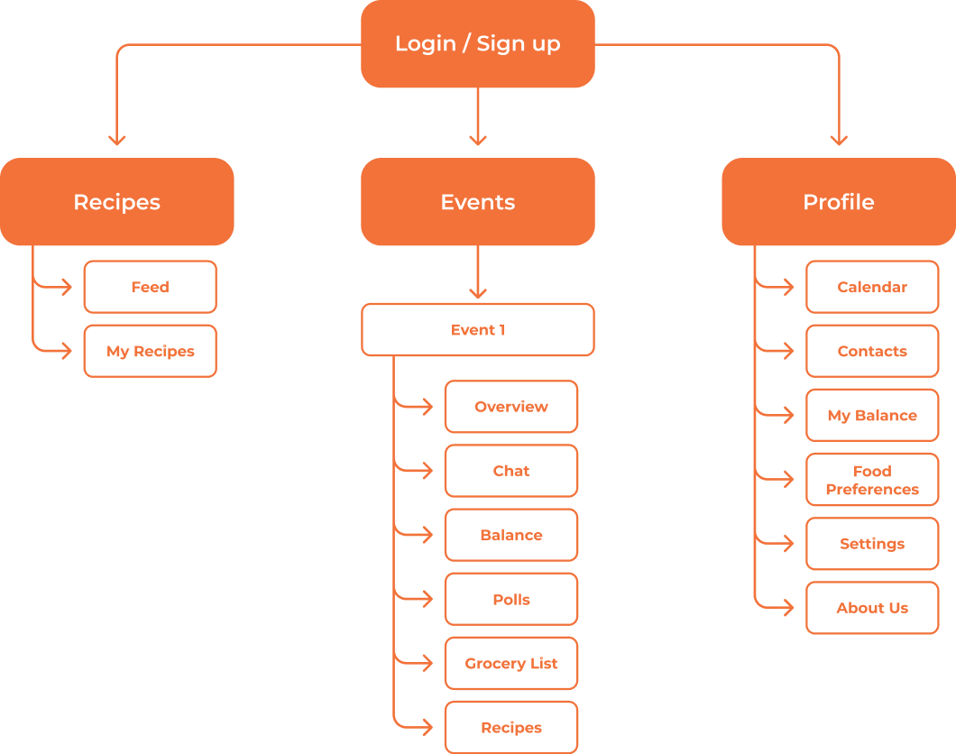
To give a full set of options to manage, we listed areas our users would find useful to tweak. These would help to create from more complex events, with two or more variables, to simpler ones, with a weekly updated grocery list.
Four user flows were designed to sell the added value the app could bring to its users:
- register/profile creation
- event creation
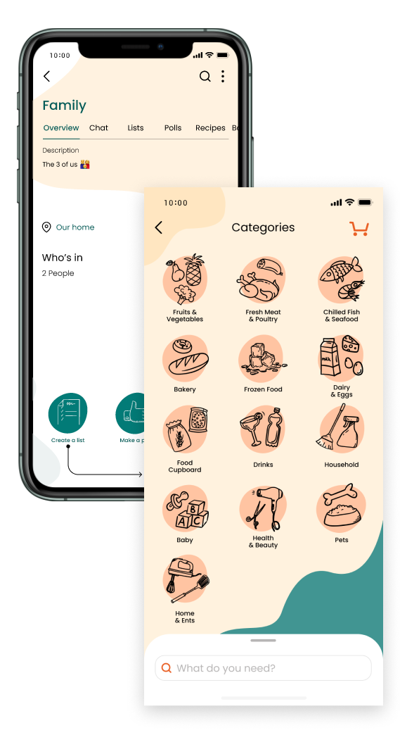
- grocery list manager
- recipe finder
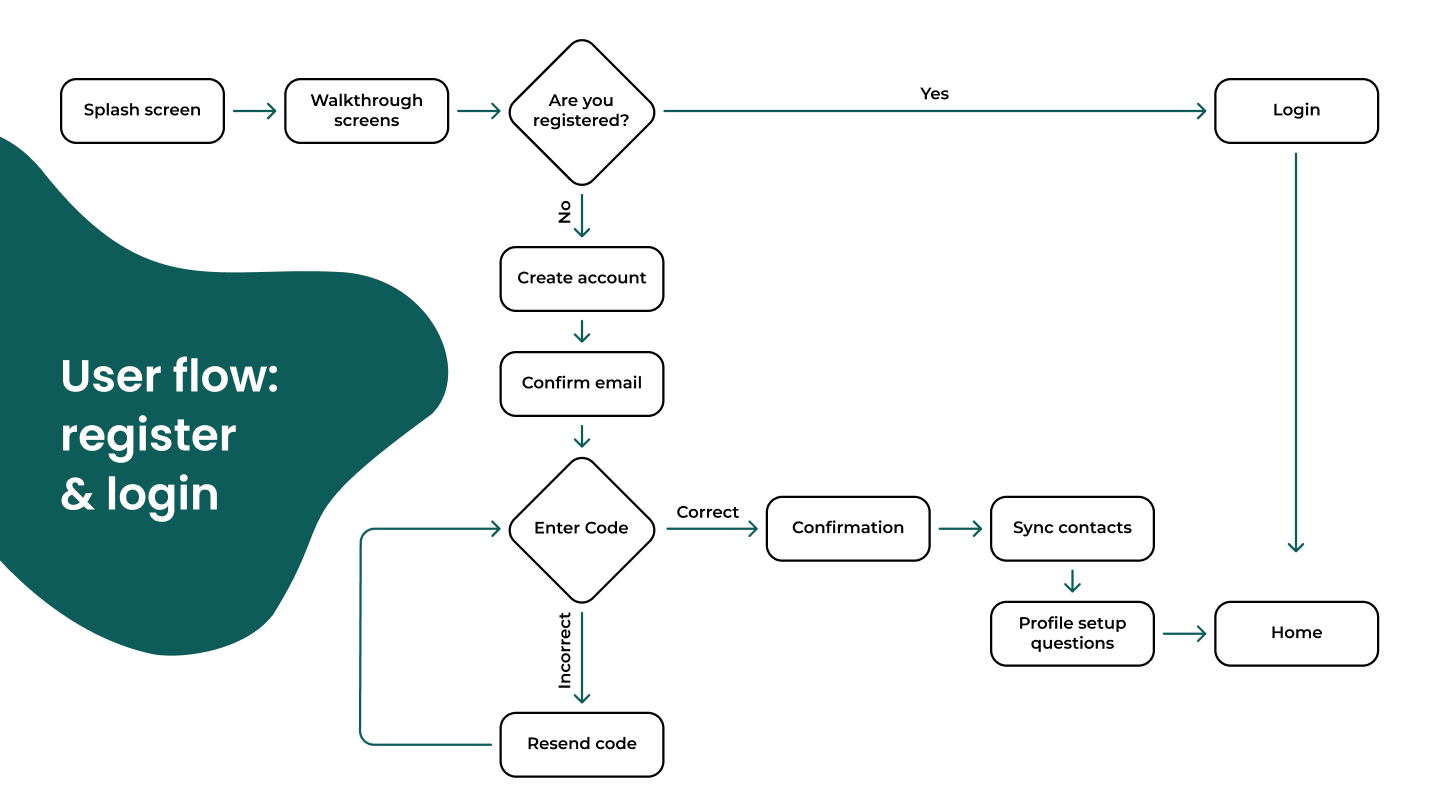
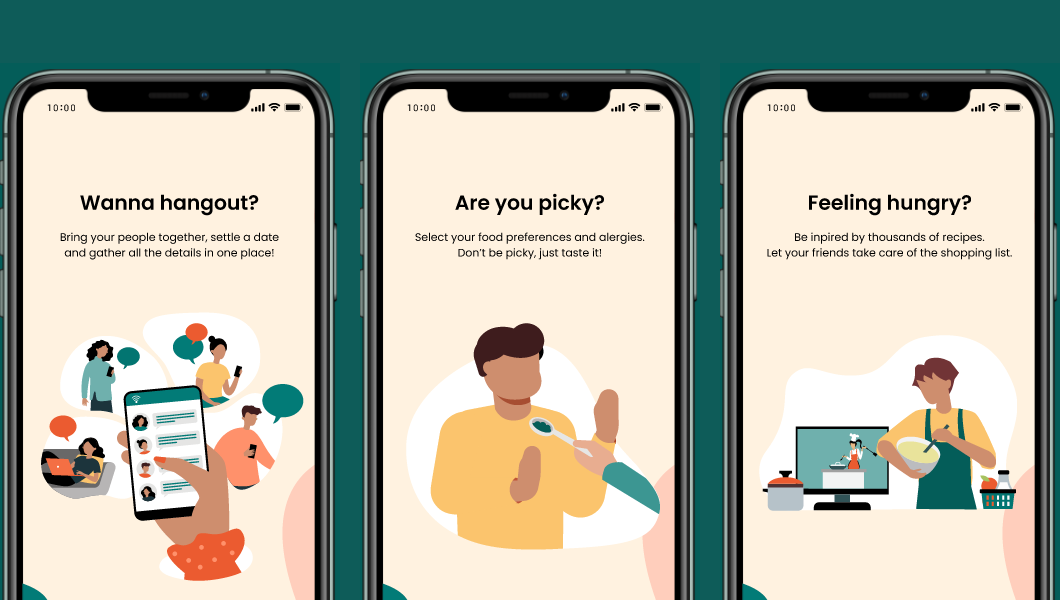
The profile area is quite important, as it feeds each feature detailed information to better manage events and suggest recipes. Ideally the user sets it up by answering four key questions and by letting the app synchronize their contacts, to later add on events.
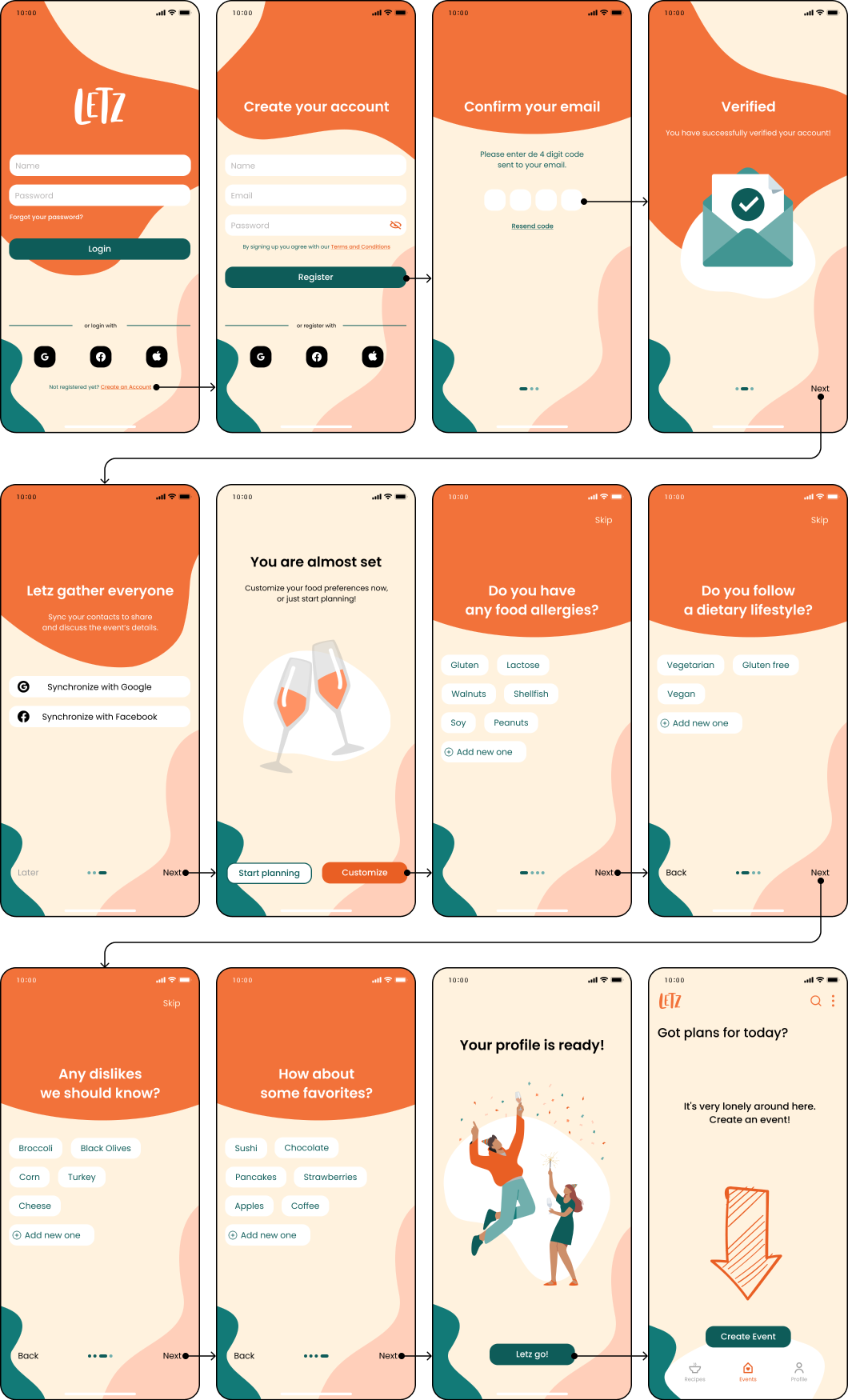
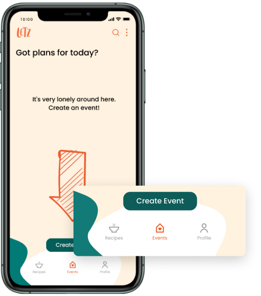
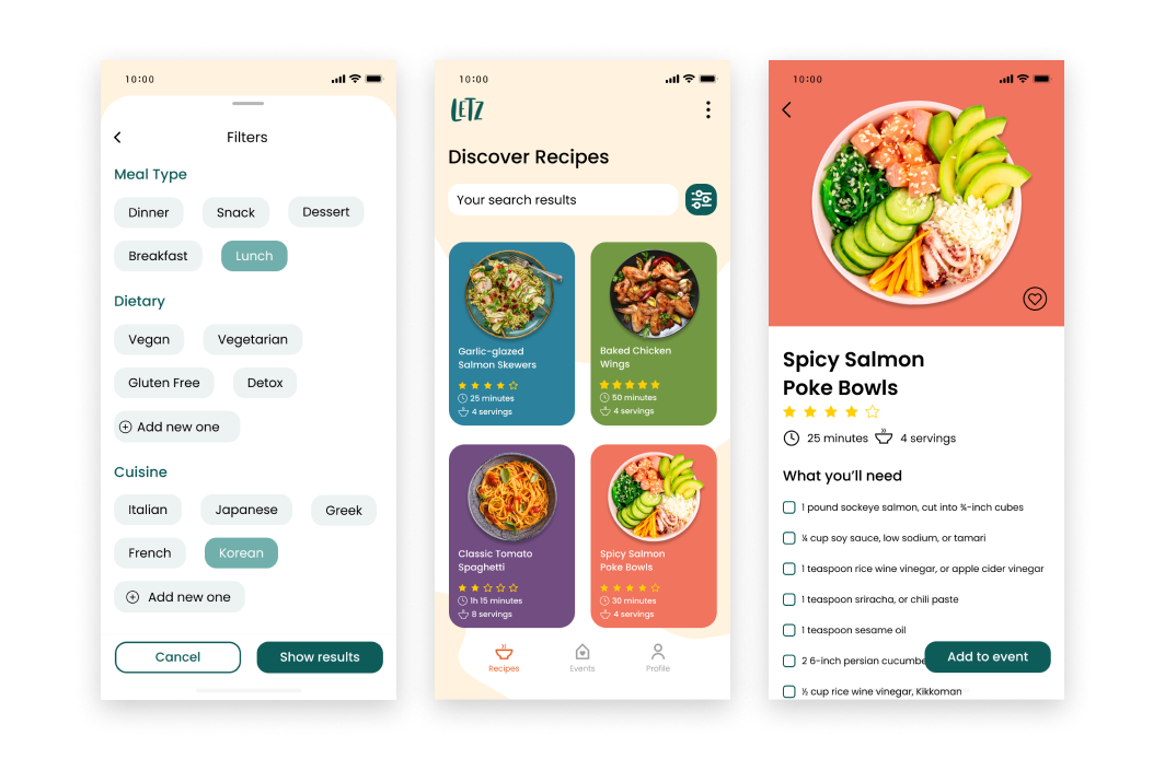
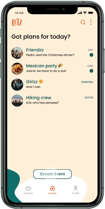
FIG09: After setting up a profile, the user gets to know the main area where events can be created.
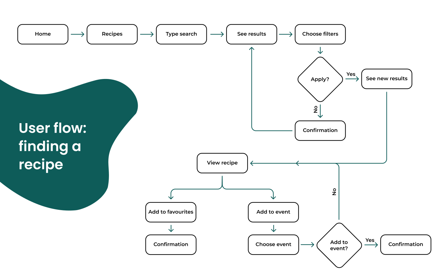
FIG09 & FIG10: The priority here was to define a broad set of filters from meal of the day, to dietary choices or type of cuisine.
Testing the four user flows was key to iterate some important details and screens in order to create a seamless experience.
FIG11 REGISTER flow test: 14 users
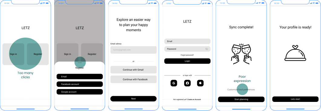
Here we identified various issues including misclicks, confusing options, and unclear screens. With feedback from a second round of testers, we refined the flow, achieving a seamless registration.
FIG12 CREATE A SHOPPING LIST flow test: 12 users
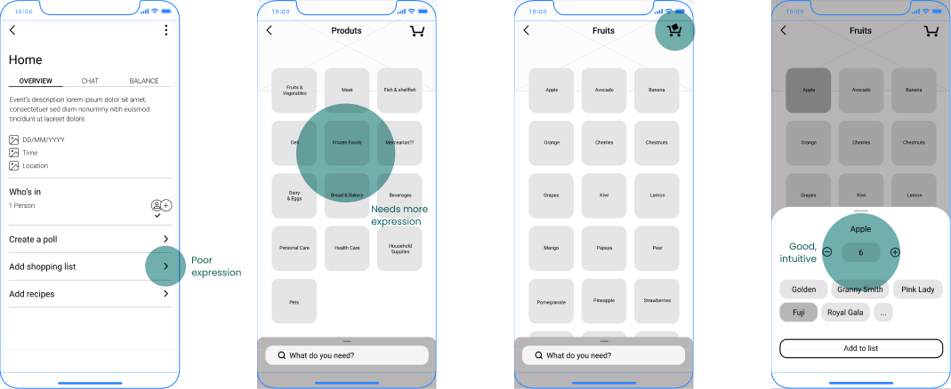
FIG13 CREATE AN EVENT flow test: 12 users
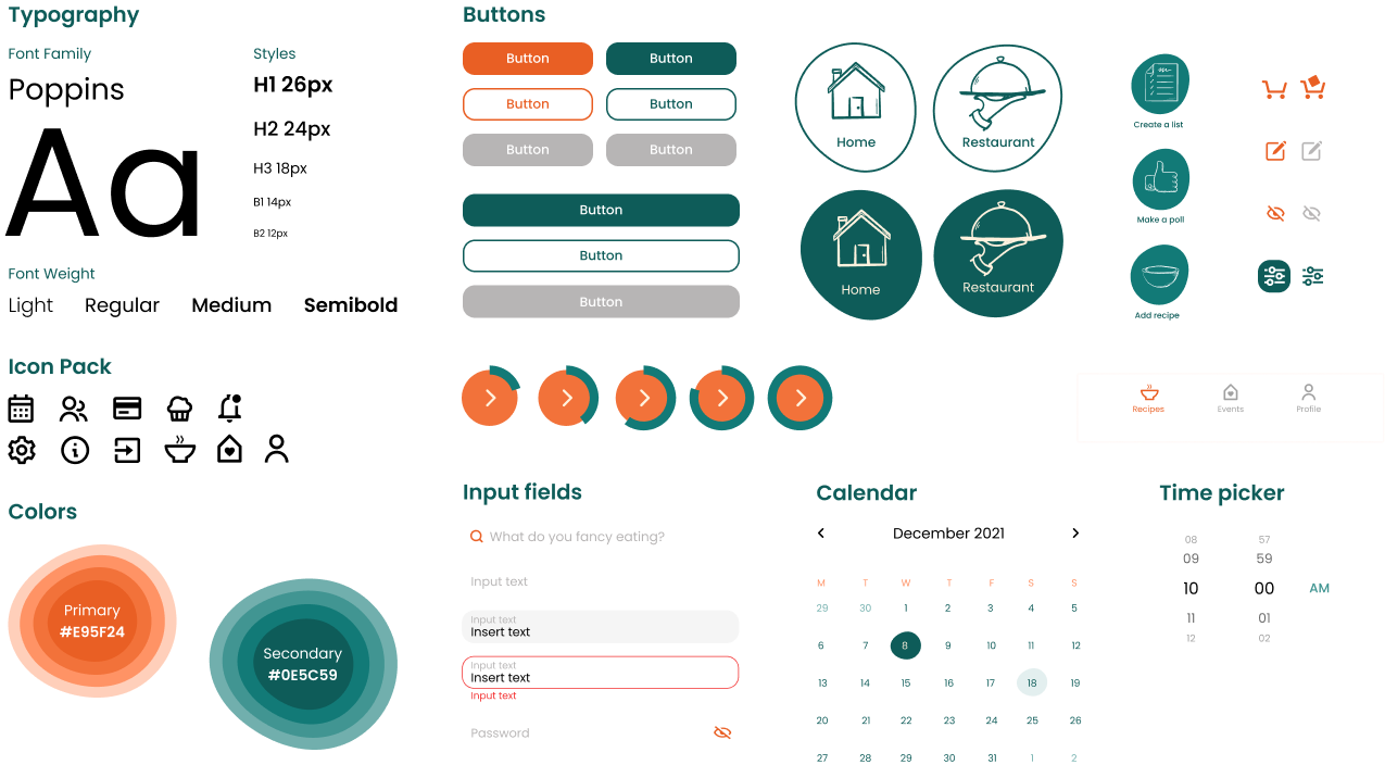
About the brand
An identity that convenes the values of the app and transports them to each screen.
It was essential to maintain consistency across all screens, from the onboarding, profile, events, group chats, recipes and user features like creating a shopping list.
A set of irregular shapes were designed to add dynamism and playfulness to the dull task of everyday management.
The buttons related to core features have a signature shape to highlight the possibilities the app offers.
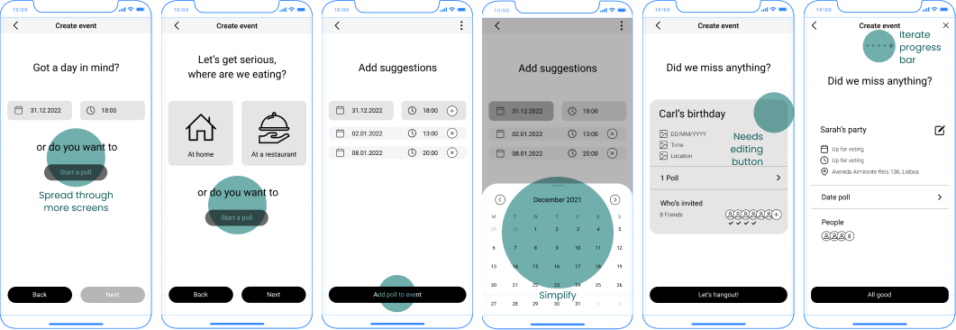
Event creation prototype
Letz!
From the need of managing the many variables that arise in a group gathering, this conceptual app takes inspiration from chat apps like Whatsapp or Telegram, but also in other handy tools like Splitwise or Bring!.
It idealizes the simplification of the process by allowing to gather in one place what the above apps offer and more: group chats, poll feature, expense control, shopping list and recipe collection.
