How can we ensure a captivating joining experience to maintain user engagement?
User research • Interviews • Functional analysis • Microcopy • Art direction • Manage the team of five
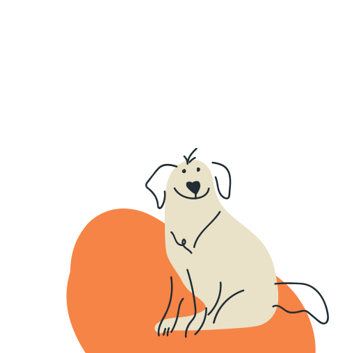
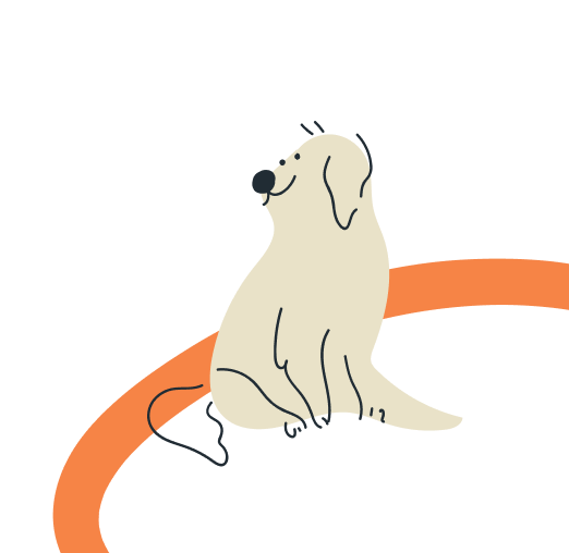
An animal friendly project about encouraging with empathy, while helping as many animals as possible and taking into account the lifestyle of each user.
When brands and services create a connection with their target audience, it is crucial to maintain that relationship and be able to evolve it overtime. This begins right at the first interaction between the two parts.
On this project, the team chose a subscription flow that needed improving and redesigned it, focusing on the user experience from beginning to end.
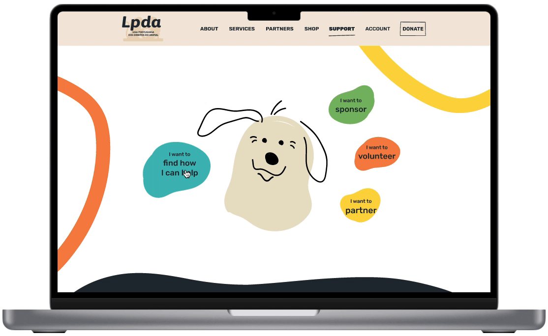
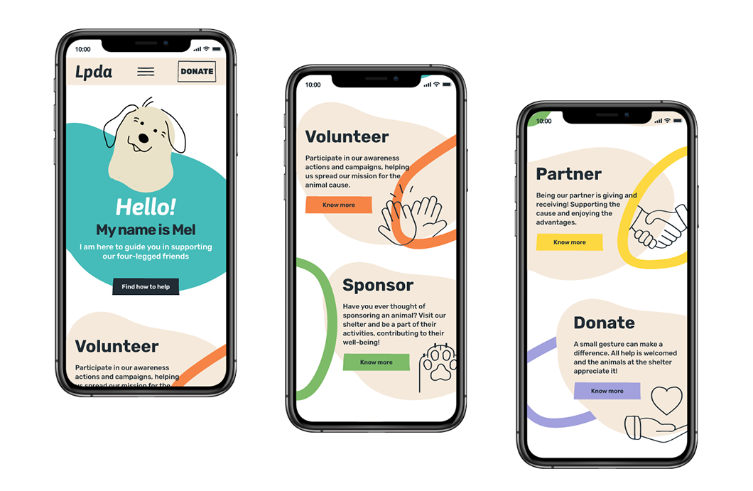
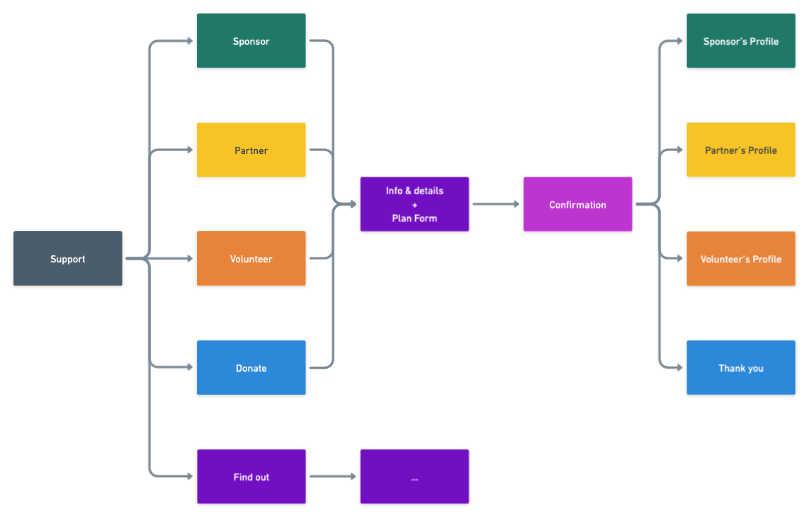
LPDA works with the animal cause and offers four ways of support: volunteering, sponsoring, partnering and donating.
To learn more about these, a couple interviews were conducted and a survey was created. We wanted to understand how people choose a way of help, why some were preferred over others, the attraction to each, and how people became aware of the different ways of help.
With 200+ participants, we determined the top three ways chosen to support the cause.
Donations were the most popular, being the most practical and quicker way of helping, “making a difference, little by little”.
Volunteering came in second, with most of the process happening online and people being motivated by helping others, "even if the other was an animal".
Curiously, most sponsoring programs ended in adoptions, nurturing the will of having a pet and alleviating the burden from institutions.
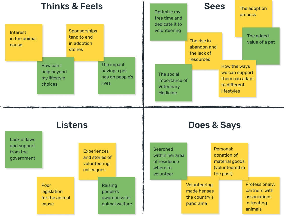
Educating people on reducing the trade of animals and raising awareness on responsible adoption were the main concerns of the cause. Our research findings led us to two main conclusions:
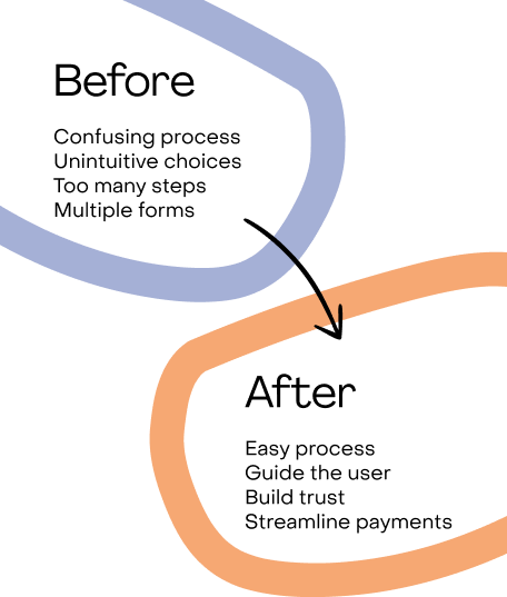
- There was a need for a better structured communication, informing and helping people to choose a type of support.
- It was important to provide an easy way of changing the plan of subscription.
Guiding the user
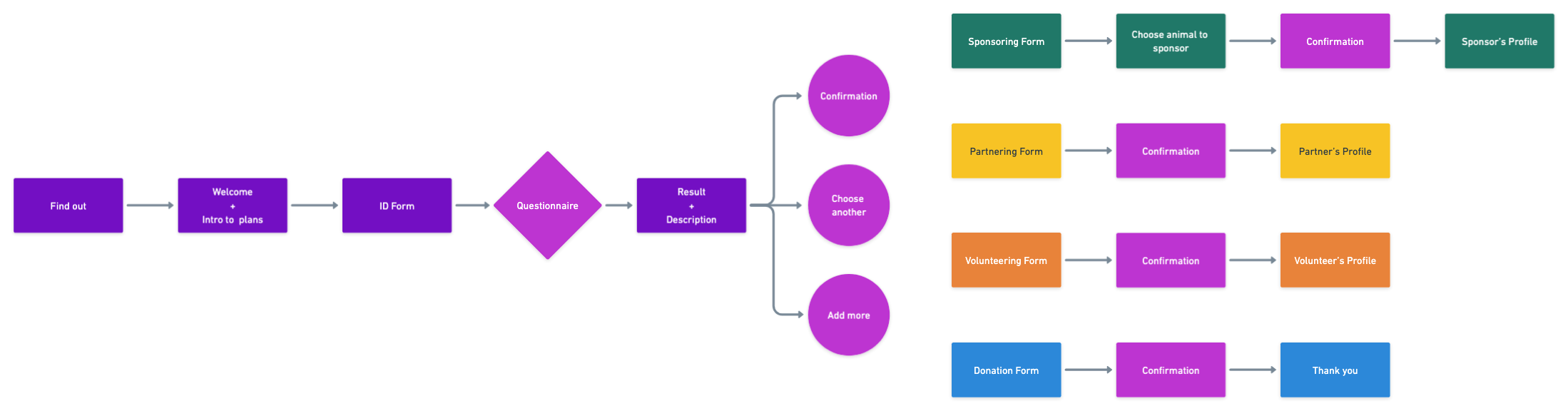
When the user already knows what to choose, the flows are straightforward.
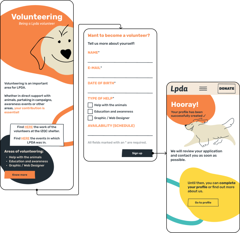
After choosing one of the four options, they are led to a page to learn all about it and fill its dedicated form, in order to register or donate.
Below we can see an example of this flow, with the volunteering registration page.
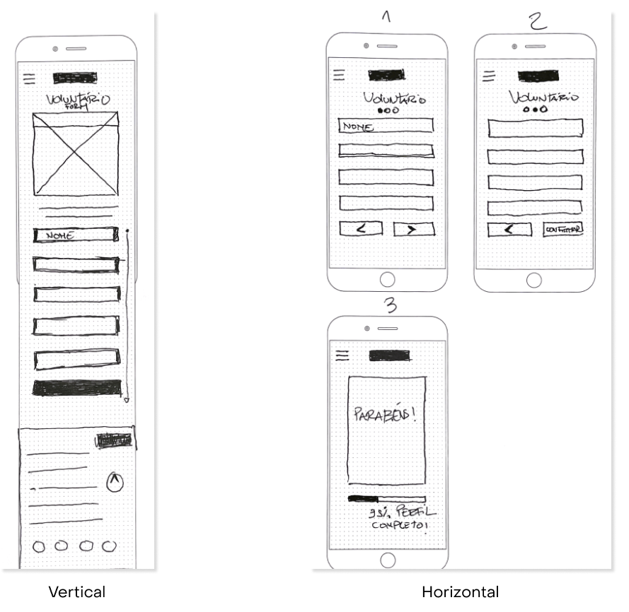
A vertical and an horizontal versions of the registration options where tested and 8 in 12 users prefered the vertical one as they felt it was more straightforward and less bothersome.
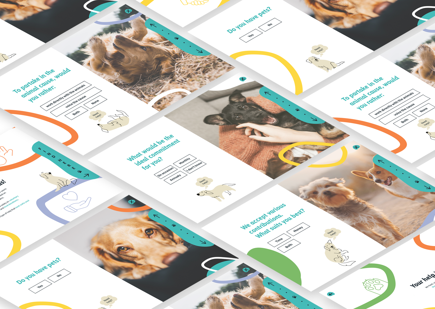
When the user selects the “find out” option, they would enter a questionnaire accompanied by a friendly dog - a chatbot - that would guide them through it.
“How can I help?”
Developing the questionnaire flow proved to be quite challenging. Our initial iterations faced criticism for unintuitive animations, confusing dynamics, a lack of clear navigation flow attributed to a poorly designed progress bar, and an excessive number of questions.
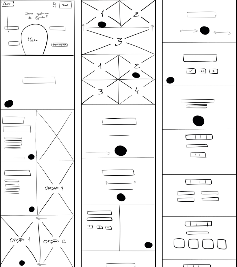
After rounds of usability testing and some interviews, a unique subscription questionnaire was designed, with four strategic questions that lead to the attribution of a subscription plan.
The goal was to pinpoint key traits of each type of user and align them with the main responsibilities and advantages of each plan. This was made possible by setting up four profiles and creating the paths that would lead to each, as seen below (user flow and design).
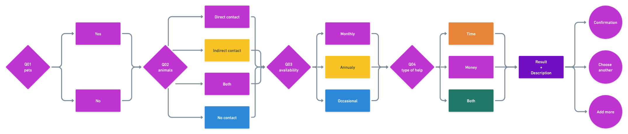
After completing the questionnaire, the user was presented with a suggested profile and then prompted to finalize the registration by answering additional questions.
In regard to the sponsoring plan, it was crucial to build an appealing gallery and keep the user interested in the several animals in need of support.
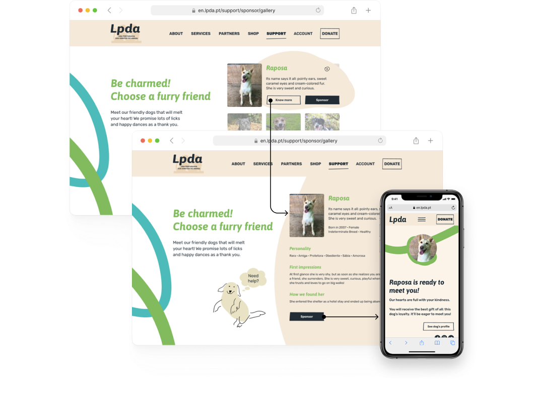
Accommodating the will and availability of those who came to the support page was key to keep them involved, while taking into account their needs.
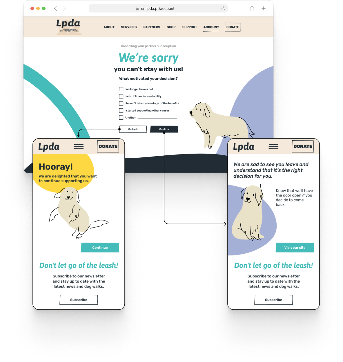
Even when it came to cancelling the subscription, there was always room for pondering.
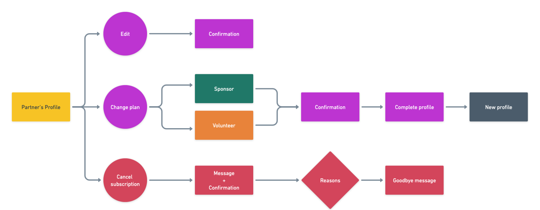
Changing plans or bidding farewell? Through microcopy and various mascot iterations, we managed to always set the tone for each page, making sure the user knew what their actions would entail.
Encouraging with empathy
With this project, we not only met the needs of institution and their rescues, but also of the users that came to their page and wanted to help.
Getting to know and reorganising how and what was communicated about their mission, led us to simplify the subscription flow. In order to get a better retention, we aimed at building a relationship between the user and them, for the benefit of the animals at their care.
By explaining and giving visual cues through both the redesign and questionnaire, an emotional connection was created in favor of informing the user to make a decision on the most convenient way to help.